Soren
Soren
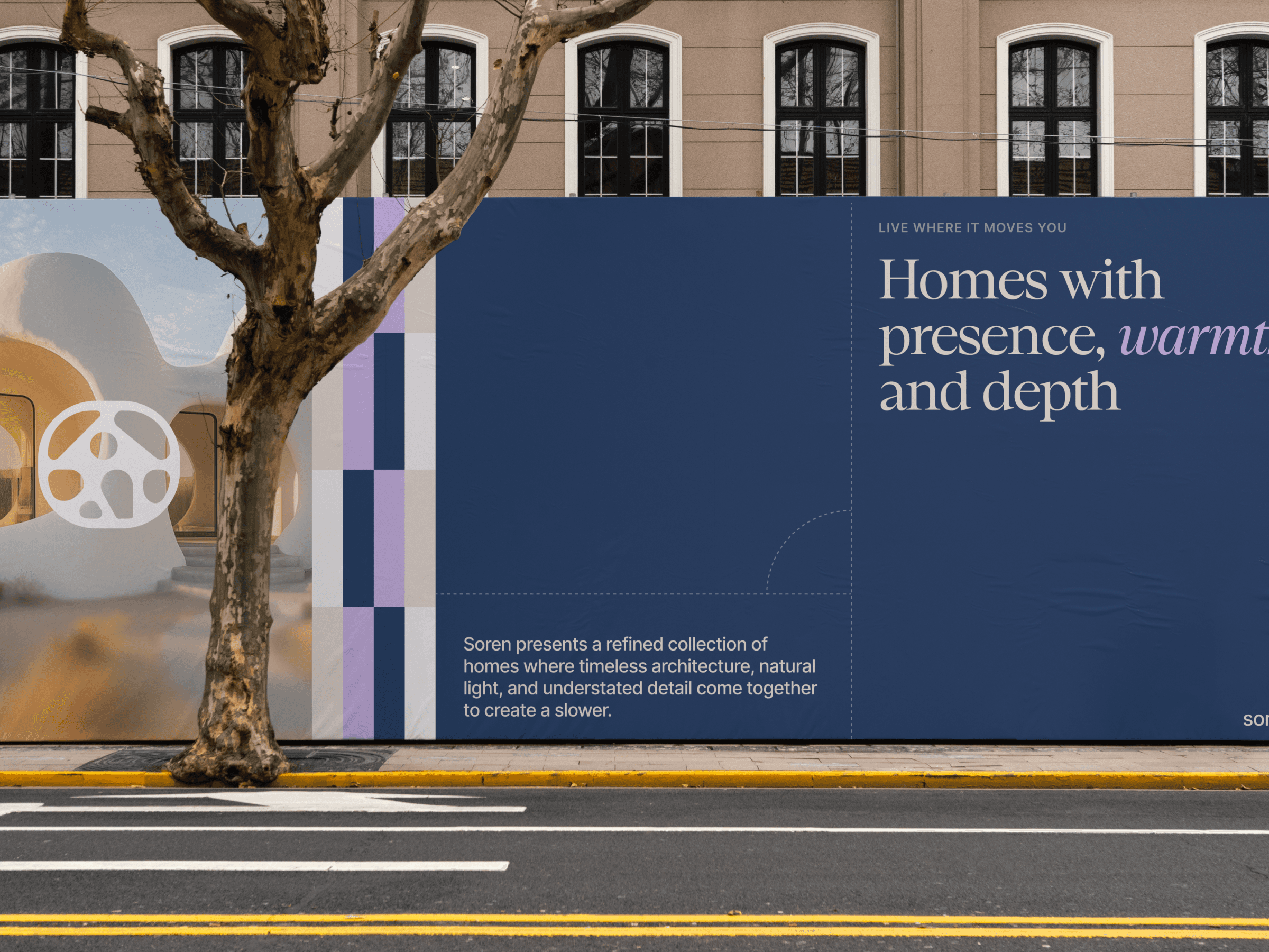
A contemporary real estate identity inspired by Mediterranean architecture

Overview
Soren is a conceptual identity created for a modern residential developer focused on thoughtfully designed homes. Rather than relying on the familiar visual language of luxury real estate, the brand embraces softness, architecture, and light to create something approachable yet refined.
Inspired by whitewashed Mediterranean buildings, deep coastal blues, and organic forms found throughout the landscape, the identity balances sophistication with warmth.


Approach
The visual system centers around an organic graphic motif inspired by architectural courtyards, stone pathways, and the flowing relationship between buildings and landscape. These forms create a distinctive pattern language that becomes recognizable without overpowering the brand.
A restrained palette of deep coastal blue, warm neutrals, soft lavender, and white introduces contrast while keeping the identity calm and inviting. Combined with an elegant serif typeface and clean layouts, the system creates a balance between contemporary architecture and human warmth.
Photography emphasizes natural light, open spaces, and authentic architectural moments rather than staged luxury.


Challenge
Most residential developers communicate through predictable aesthetics—dark palettes, rigid geometry, and generic luxury messaging. The challenge was to build a brand that still felt premium while expressing openness, comfort, and a genuine sense of place.
The identity also needed enough flexibility to live across print, digital marketing, social media, signage, and property collateral without losing recognition.

Outcome
The result is a flexible identity that feels modern, memorable, and emotionally engaging. Instead of competing through extravagance, Soren communicates confidence through simplicity—creating a visual language that supports everything from property launches to digital campaigns while remaining instantly recognizable.


