Ovara

Overview
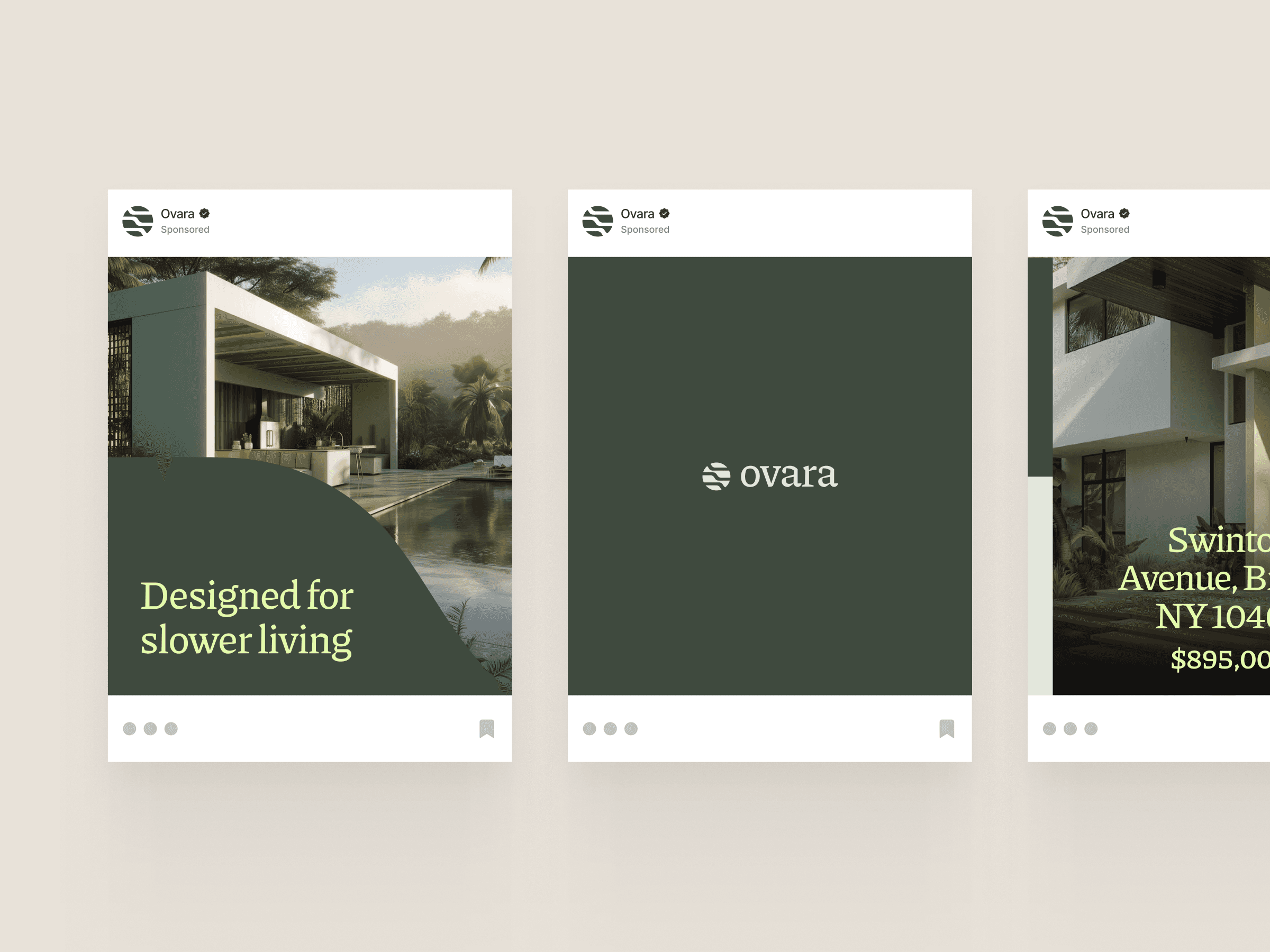
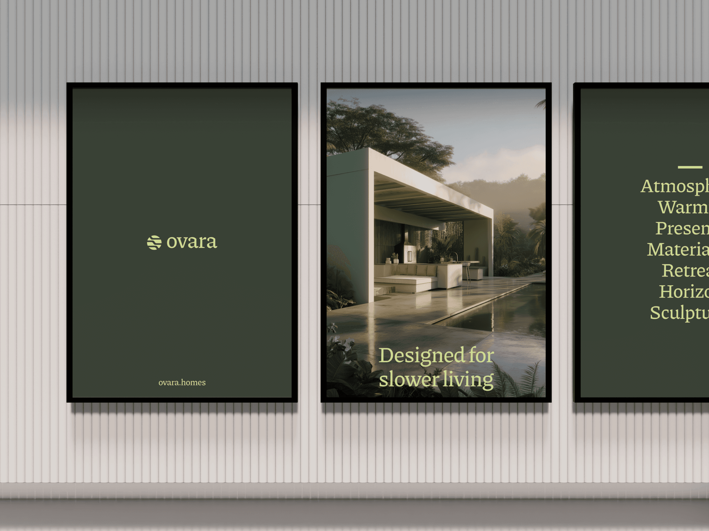
Ovara is a conceptual identity designed for a residential developer creating thoughtfully crafted living spaces that feel connected to their surroundings. Rather than relying on conventional luxury cues, the brand communicates quiet confidence through restrained typography, sculptural forms, and a grounded visual language.
Drawing inspiration from contemporary architecture and natural landscapes, the identity balances precision with warmth to create a timeless presence across every touchpoint.


Approach
The identity is built around a modular graphic system inspired by architectural silhouettes and repeating structural forms. These geometric elements create a recognizable visual language that can expand across layouts, social media, and printed applications while maintaining a strong sense of rhythm.
A palette of deep forest green, muted sage, and warm neutrals reinforces the connection between architecture and nature, while elegant serif typography introduces refinement without feeling overly decorative. Minimal compositions and generous spacing allow the brand to communicate with clarity and restraint.


Challenge
Residential branding often leans heavily on generic luxury aesthetics, making many developments feel interchangeable. The challenge was to create a distinctive identity that reflected architectural quality while remaining calm, approachable, and memorable.
The system also needed the flexibility to scale across digital platforms, printed collateral, environmental graphics, and marketing materials without sacrificing consistency.

Outcome
The result is a versatile identity that feels contemporary, distinctive, and enduring. Rather than competing through excess, Ovara establishes recognition through consistency, creating a visual system capable of supporting residential launches, marketing campaigns, and long-term brand growth.


