MOF
MOF
Transforming fashion’s heritage into a modern visual narrative

Overview
MOF was conceived as a bold fashion brand rooted in craftsmanship, identity, and visual storytelling. Its founders wanted more than seasonal lines — they wanted a brand that embodied the philosophy of fashion as art.
From the start, they saw MOF as a bridge between legacy techniques and modern sensibilities, crafting garments that speak to both history and the present.
Before the rebrand, MOF’s visual presence felt fragmented: different collections had inconsistent imagery, the brand voice wavered, and it lacked a unifying identity that tied fashion, material, and emotion into a cohesive whole.
The objective was to refine that visual voice, giving MOF an identity strong enough to carry across runway, lookbooks, packaging, and digital spaces.

Approach
We began by immersing ourselves in fabric swatches, garment construction, and editorial fashion photography. We looked at how light played on textiles, how raw edges and stitching tell a story, and how the human form interacts with fabric.
Inspired by that materiality, we developed a visual metaphor grounded in textures and structure but reinterpreted digitally. The core of the identity became a concept of “woven geometry” — shapes that feel structured yet organic, lines that echo stitches and folds. The logo and wordmark grew from that idea, with subtle cues of weave and thread directionality.
In typography, we selected letterforms with contrast and character — enough edge to feel fashion-forward but grounded so they don’t overshadow imagery. The color palette leaned into natural neutrals and deep accent tones, inspired by fabric dyes and natural palettes, ensuring the identity would feel graceful and refined.
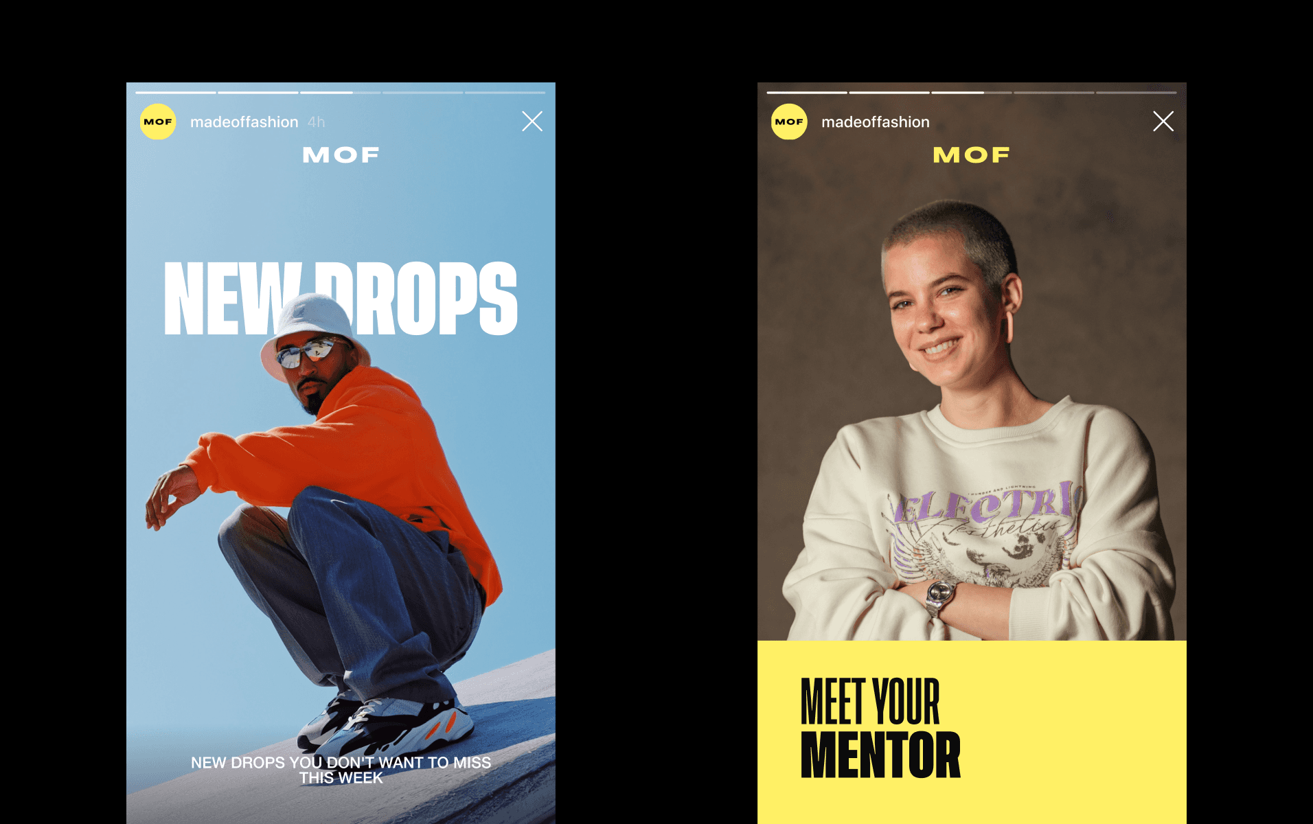
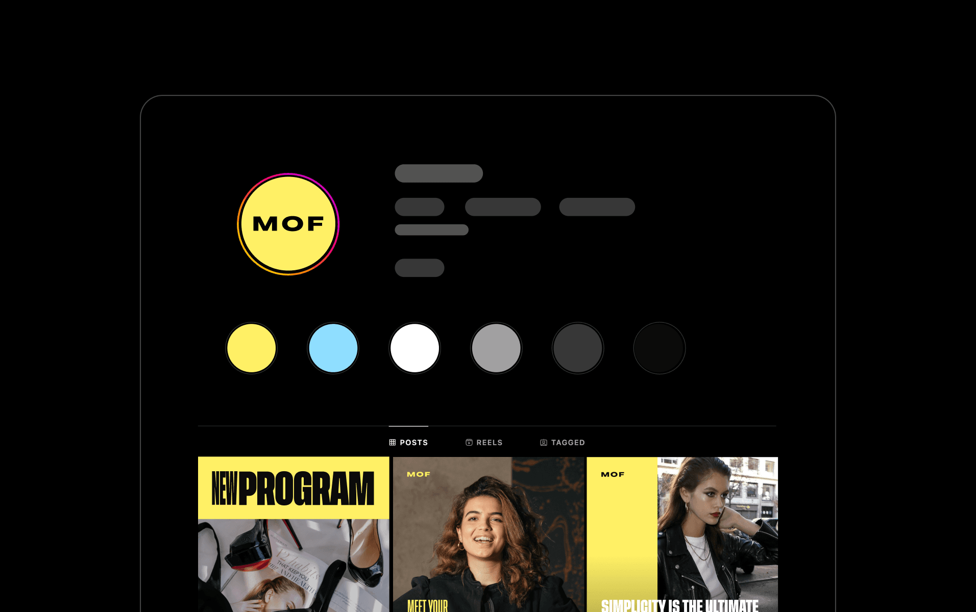
Once the brand foundation was set, we layered it onto real applications. In lookbooks and editorial spreads, the geometric motifs provided rhythm and framing for imagery. On packaging and hang tags, texture and craftsmanship came alive through emboss, cutouts, and finishes that echo the material roots of fashion.
In digital spaces, we carried the visual language through subtle motion — overlays that shift like fabric in the wind, transitions that mirror folding, soft reveal effects that feel tactile. Each piece of the system was tested to ensure it felt cohesive whether in print or pixel.
Challenge
Fashion is a crowded field, saturated with logos, patterns, and visual tropes. The risk was that MOF would look like any other high-end label unless we gave it a distinctive signature. The identity needed to honor the tactile, textured, handcrafted nature of clothing while also fitting into sleek digital platforms.
It needed to feel luxurious without being ornate, expressive without being overdone. On top of that, the system had to scale: from editorial spreads and physical hang tags to web, mobile, and social, all while maintaining consistency. Time, budget, and production constraints meant every visual element had to serve a purpose — nothing ornamental for its own sake.

Outcome
The refreshed MOF identity transformed the perception of the brand entirely. What had once been visually inconsistent now feels singular and unmistakable. In fashion circles, MOF is talked about not just for its design, but also for its visual storytelling — people recognize the brand by its aesthetic structure before even seeing the name.
The new identity is flexible but distinct, allowing MOF to expand into new collections without losing core identity. Stakeholders reported that buyers, press, and collaborators responded much more confidently — the brand now commands presence. The system feels alive, rooted in materiality but translated for the modern audience, giving MOF both heritage and edge.


