WeWo
Overview
WeWo is a crypto startup built to bridge the gap between complex blockchain systems and real human understanding. Their mission was to make decentralized finance approachable for everyday users — less intimidating, more intuitive, and built on genuine trust. While most crypto brands still looked metallic, rigid, and overly technical, WeWo saw an opportunity to lead with clarity and warmth. They wanted an identity that would feel fresh and human, yet still signal the confidence and intelligence behind the technology.


Approach
The process started with research. We analyzed crypto and fintech brands across the market and identified the recurring patterns — sharp geometry, dark gradients, and disconnected metaphors. Everything felt predictable. From that insight, we deliberately went the other direction: instead of technical rigidity, we pursued organic connection. The goal was to make users feel like WeWo isn’t a machine but a living, breathing network built for people.
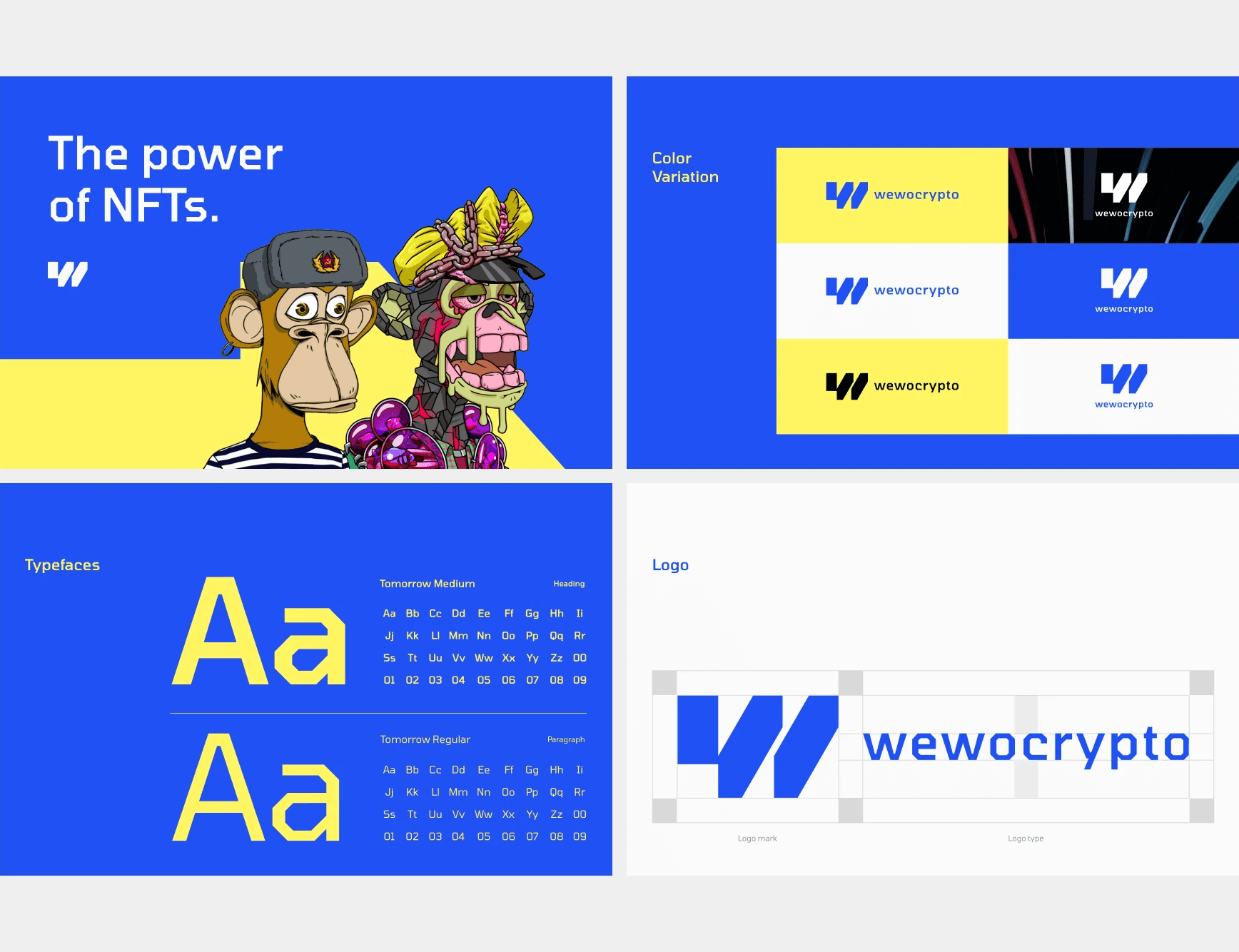
The concept “connection in motion” became the creative anchor. It represents how blockchain connects data — and how people connect through trust. The logo grew out of this metaphor: a simple, continuous form inspired by nodes and paths, but drawn with softness and rhythm. It’s not static; it feels like it’s moving even when standing still.
Typography followed the same idea. We chose clean, geometric letterforms with subtle curves that humanize the system. The type feels modern and trustworthy, but it doesn’t shout — it guides. The color palette moved away from the typical blues and blacks of crypto. Instead, we built around contrast: muted neutrals balanced with a single vibrant accent that feels alive, optimistic, and energetic.
Once the identity foundation was in place, we expanded into application. Every decision had to scale — from app icons to motion design. We built mockups for dashboard interfaces, website hero sections, and product previews to ensure the brand performs under real conditions. The motion design brought it to life — soft transitions, flowing line animations, and elements that subtly connect and separate, mirroring how crypto systems operate underneath.

Challenge
Crypto, by nature, sits at the intersection of innovation and skepticism. People want to trust the technology, but the visuals often make it feel distant and inaccessible. The biggest challenge was to express technical strength without alienating users with complexity. We needed to balance two opposing forces: the credibility of finance and the friendliness of modern consumer brands.
WeWo also had practical challenges — their identity had to scale across multiple platforms: product UI, website, social media, and partner materials. It needed to work in both digital motion and print, with a visual language flexible enough to evolve with future products. The timeline was tight, and the expectation was high: to deliver a full visual system that felt confident, minimal, and emotionally intelligent.

Outcome
The new WeWo identity transforms how people perceive the brand. What once looked like another faceless crypto startup now feels confident, original, and human. The redesign introduced a cohesive visual language that builds trust at first glance and creates space for future growth.
Stakeholders reported that the refreshed brand immediately improved investor perception and helped differentiate WeWo in a crowded space. The new system is flexible enough to evolve with upcoming products while maintaining strong visual consistency. It now communicates exactly what WeWo stands for — a modern, secure, yet human approach to crypto.
This project became a reminder that trust isn’t built through complexity; it’s built through clarity. The strongest design isn’t about showing how advanced a product is, but how confidently it can communicate simplicity. WeWo now carries that belief in every detail of its brand.


