Case study
MXXRS
A lifestyle and fitness brand for people who bring the same ambition to training, health and business.
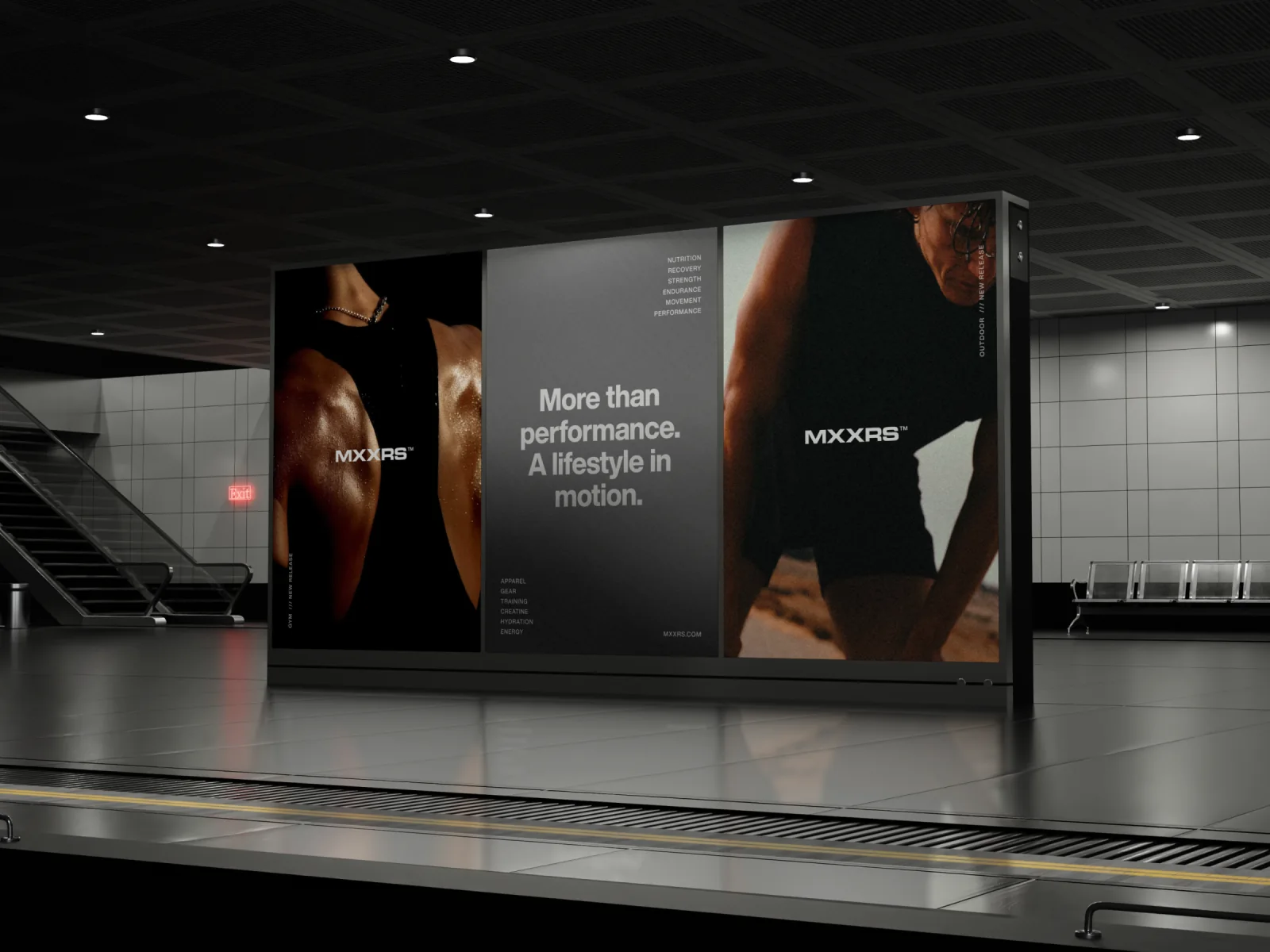
Beyond the gym
MXXRS starts with a familiar kind of person. They make time to train before work, think about how they recover and bring that same discipline to the business they’re building. Getting the most out of the day means giving each of those things its place.
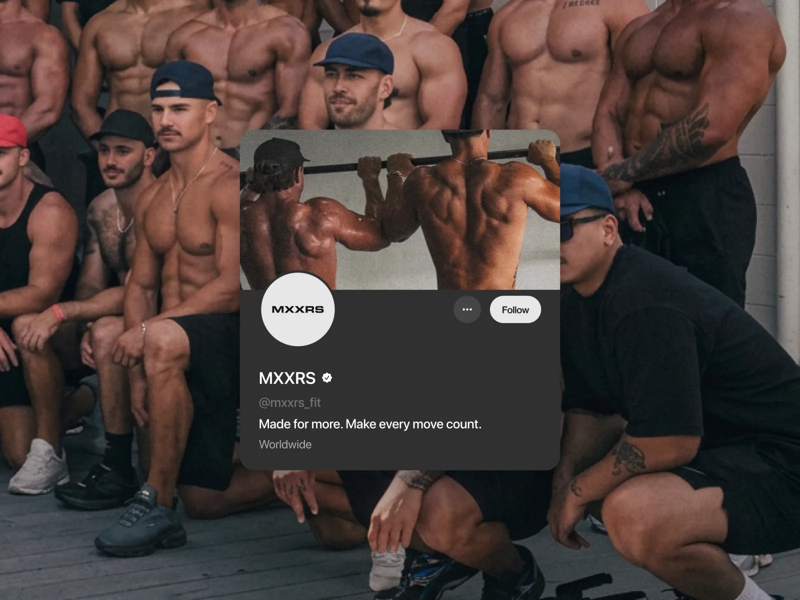
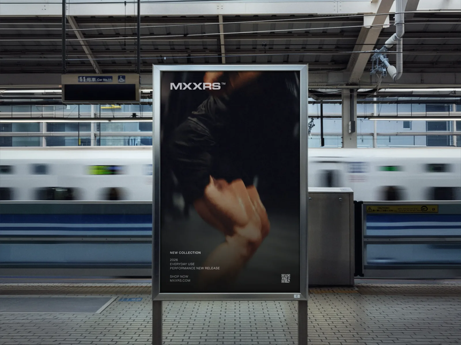
We gave that idea a compact, wide wordmark. In the group portrait it sits quietly beside the athletes. On the platform poster it is large enough to catch your eye as a train passes.
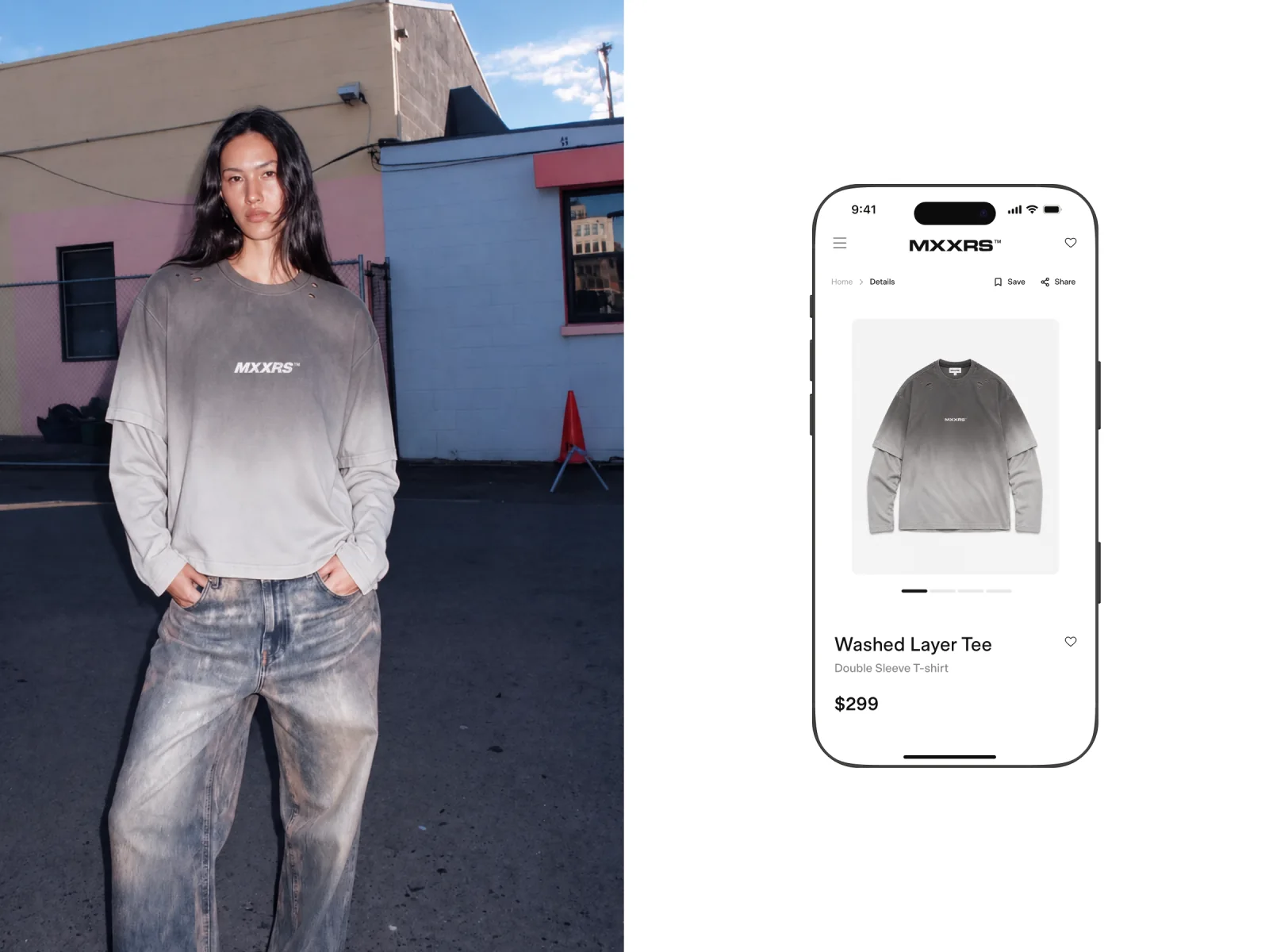
One tee, two views
The street portrait shows how the Washed Layer Tee falls across the shoulders and how the sleeves sit together. On the mobile shop concept, the same shirt is photographed on its own so you can see the cut and the grey wash up close.
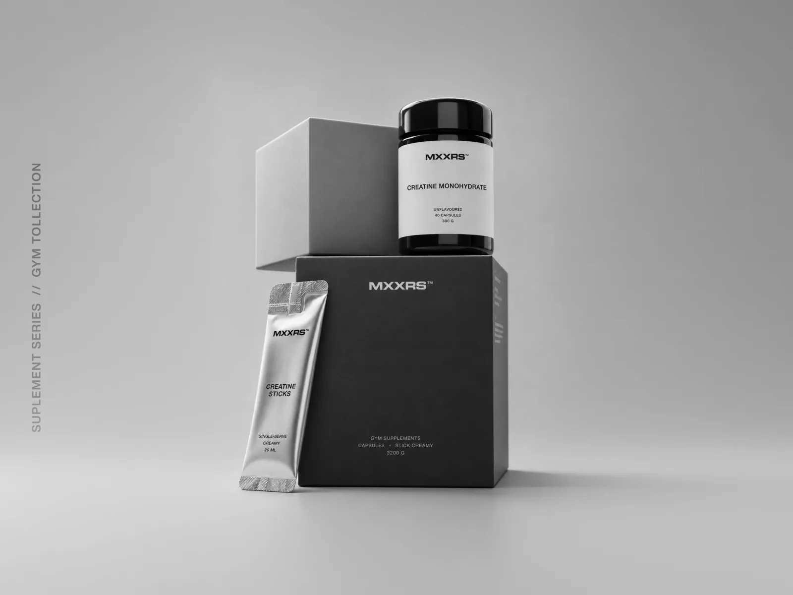
A shelf of black, white and silver
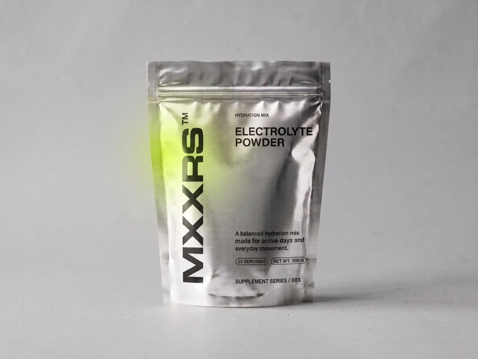
For the supplement packaging, the shape of each pack sets the layout. On the creatine jar, the wordmark sits above a plain product label. On the silver hydration pouch, it turns on its side, leaving the broad front panel free for the product name.
From the feed to the platform
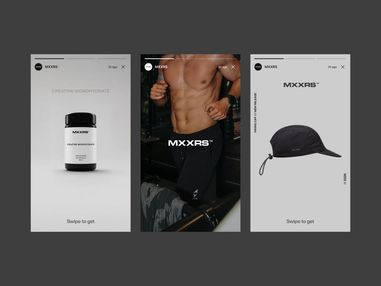
The story layouts move between a runner mid-stride and still shots of a cap and a supplement jar. For the station poster, a single cropped stride fills the frame. Both formats leave enough space for the MXXRS name to register at a glance.
Coming soon to mxxrs.com
The campaign, packaging and shop designs shown here are a first look at MXXRS ahead of its website launch.