Case study
Soren
A contemporary real estate identity inspired by Mediterranean architecture.
Overview
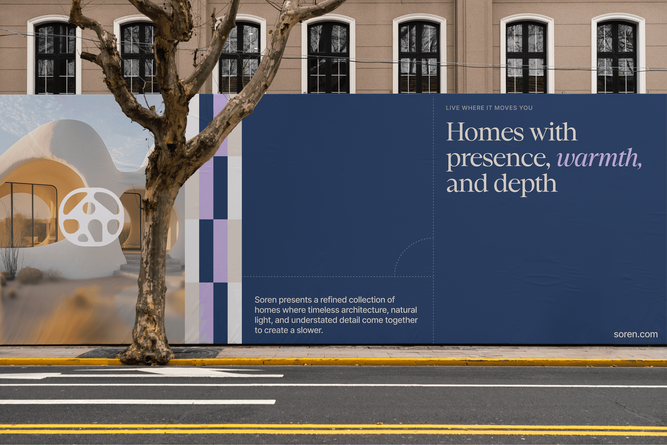
Soren is a conceptual identity for a residential developer focused on thoughtfully designed homes, inspired by Mediterranean architecture, coastal color, natural light, and organic form.

Challenge
The identity needed to feel premium without falling into the dark palettes, rigid geometry, and generic luxury language common across residential development.
Approach
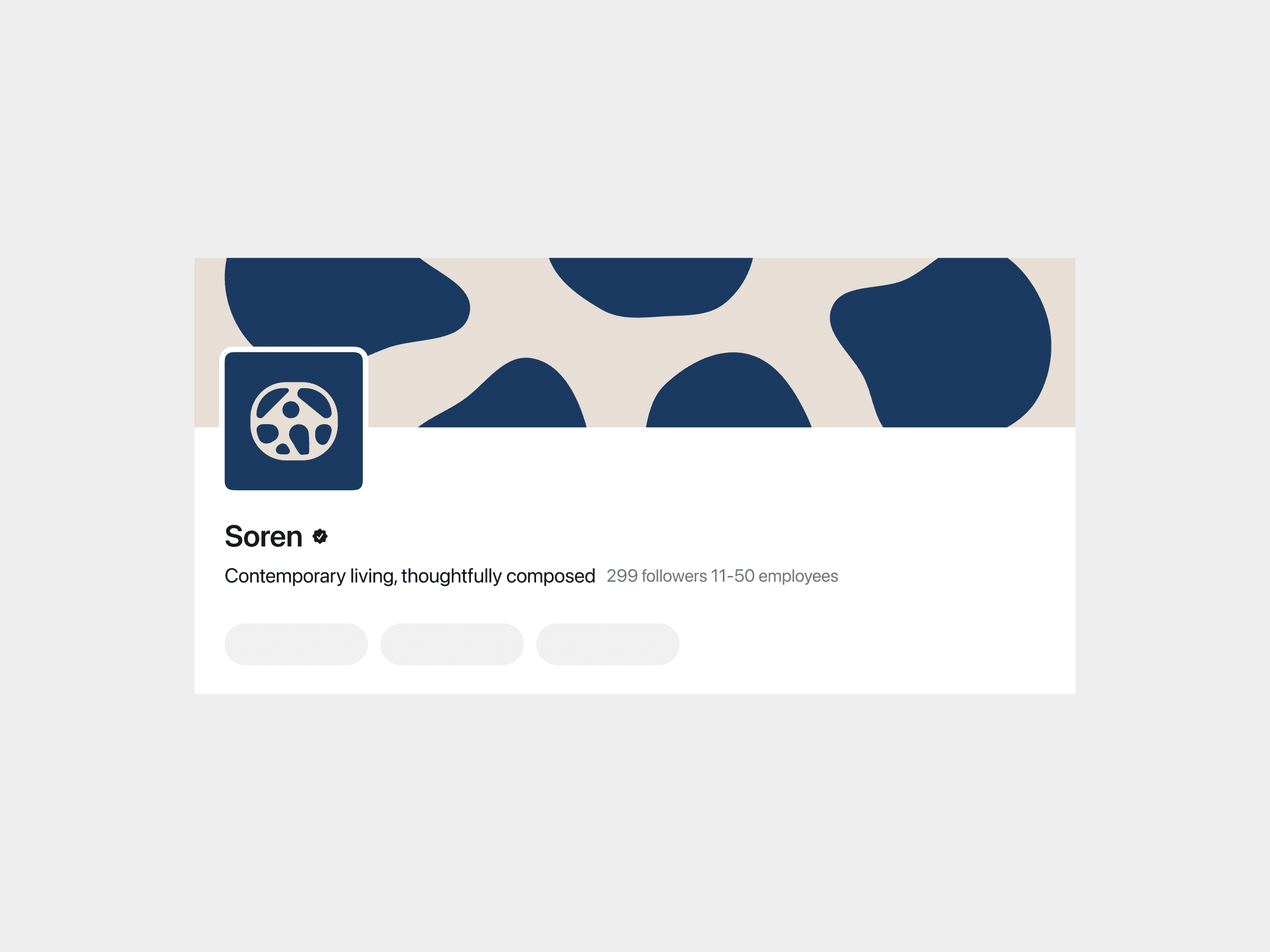
Organic motifs inspired by courtyards and pathways combine with coastal blue, warm neutrals, soft lavender, serif typography, clean layouts, and light-filled photography.
Solution
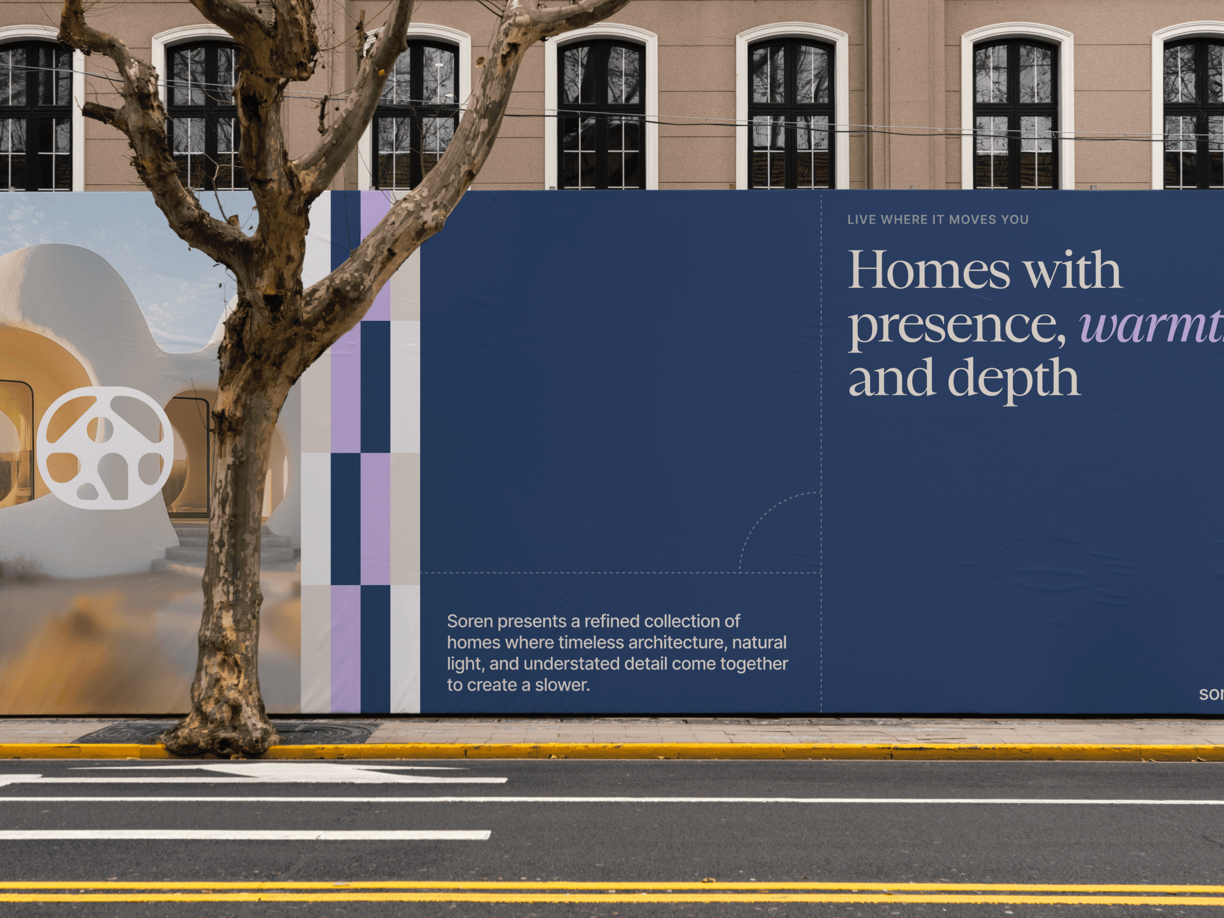
The flexible system communicates confidence through simplicity and works consistently across property launches, digital campaigns, print, signage, and collateral.


